
The Nintendo NES was a strange beast when it came to how it generated a video signal. Most other retro video game systems generated colour information internally (and often externally) in a combination of well defined red, green and blue values and then later combine or converted them into various broadcast signals like composite video, S-Video, component YPbPr (or just amplified and coupled appropriately for RGB over SCART).
Instead, the NES generated its video internally, within its PPU (Picture Processing Unit), directly in the composite video domain. While in theory we should be able to map these values directly to the RGB colourspace, in reality there are a number of issues related to the properties of CMOS electrical characteristics (how voltages rise and fall within the physical chip), and the electrical interference or “noise” this produces. In addition, the NES generated video levels internally that, for some colours, were slightly above the agreed specification for composite video, which meant that some of the colours fell into an area not defined by any television or broadcast standard, resulting in different clamping levels per display.
Add to this the enormous variability of consumer television accuracy that existed in the mid 1980s, as well as slight modifications in board and PPU revision across the various hardware revisions of the Famicom and NES, and the result is that defining the actual colours seen on screen when playing an Nintendo NES game is almost impossible.
The Nintendo NES has seen a huge variety of community and commercial video mods, emulators, and more recently FPGA implementations that all offer RGB video out (or similar high end colour spaces for digital out over DVI or HDMI) for crystal clear video. However due to all of the problems mentioned above, the colour palette of the Nintendo NES is statically represented as a best-effort attempt to match the original Nintendo NES as it was seen by the viewer.
There’s always debate within the retro community over what is the “best” palette to use, however it’s important to emphasise that there is no true “best”, due to all of the issues mentioned.
I’d previously begun a video series detailing how retro gamers can use inexpensive but still good quality calibration equipment to ensure their video displays, whether they be CRT, LCD or OLED, accurately show colours as intended by the various broadcast video standards. This ensures you’re not suffering issues where colour information is being lost because brightness, contrast or colour settings are set too high or too low, and ensures a standard is being met that is far more accurate than calibrating by eye. The human eye is quite incredible when it comes to seeing differences in luminance, but far less capable of judging accurate colour, which I cover in the introduction video.
https://www.youtube.com/playlist?list=PLyXPSTsxUZq5zgE_5ZHi2cdfE2–66DjZ
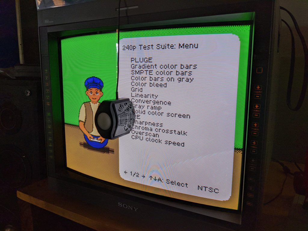
While doing these videos, I wondered if I could use the same highly accurate colour measurement hardware to compare NES palettes to original hardware. The 240p Test Suite offered me a way to generate 52 of the NES’s colours to measure directly, so I decided to try on my calibrated Sony PVM D20 CRT. I compared a Japanese AV Famicom, an Australian PAL NES, and the MiSTer FPGA running the NES core, along with 18 palettes.
The process was lengthy, which each run of all equipment and palettes taking somewhere in the order of 4-6 hours, and it was a process I had to repeat several times while I worked out bugs in either the software I wrote to help me, or discovered new bugs in the MiSTer’s analogue IO board output.
Using the CIE Delta E 2000 formula, or “dE”, this gives a single number that represents the “colour difference” between two colours. This improved formula over the 1976 and 1994 formulae does a much better job of taking into account how human eyes work biologically, and the sensitivities we have to certain colours and luminance levels over or under others.
https://en.wikipedia.org/wiki/Color_difference
The standard tells us that a dE value of 2.0 or lower is desired, as this is considered the “just noticeable difference” limit.
Prior to my measurements, I ensured my PVM was calibrated to the Rec. 601 specification. There have been some comments around my choice of that standard and the D65 (6504 Kelvin) white point chosen (versus the D93 white point that was common in Japan during the 80s, since superseded by Rec. 601, Rec709 and Rec2020 standards that all defined D65). But it’s worth remembering that my choice of white point isn’t of consequence, as I’m measuring the colour difference between colours on a palette. If I changed my white point o D93, the colour difference, with respect to spectral sensitivities, would chance by such tiny fractional amounts that it would have zero net effect on the results.
https://en.wikipedia.org/wiki/Rec._601
The Rec. 601 calibration is far more important to maintain a consistent gamma and colour saturation levels, to ensure no crushing of detail at either the high or low end of colours or luminance.
For each test I attempted to luminance-match the colours “00” (dark grey), and “20” (identical to “30”), pure white to the reference console. This would ensure the least amount of colour drift from the display itself, and give each palette the most fair opportunity (taking into effect the brightness of the palette author’s displays when they created the palette). Additionally during the final mathematical calculations, I produced an “adjusted” palette that mathematically matched the luma value of the comparison console, again in an attempt to play fair should the palette author have had a different gamma on their displays.
Each run uses the ArgyllCMS tool “spotread” to take the colour “30” (pure white) as a reference to the CIEL*a*b* value of 100,0,0, and then measures the 52 colours relative to it. Again, this plays fair for variances in displays, and also nullifies the “D65 vs D93” white point debate.
https://en.wikipedia.org/wiki/CIELAB_color_space
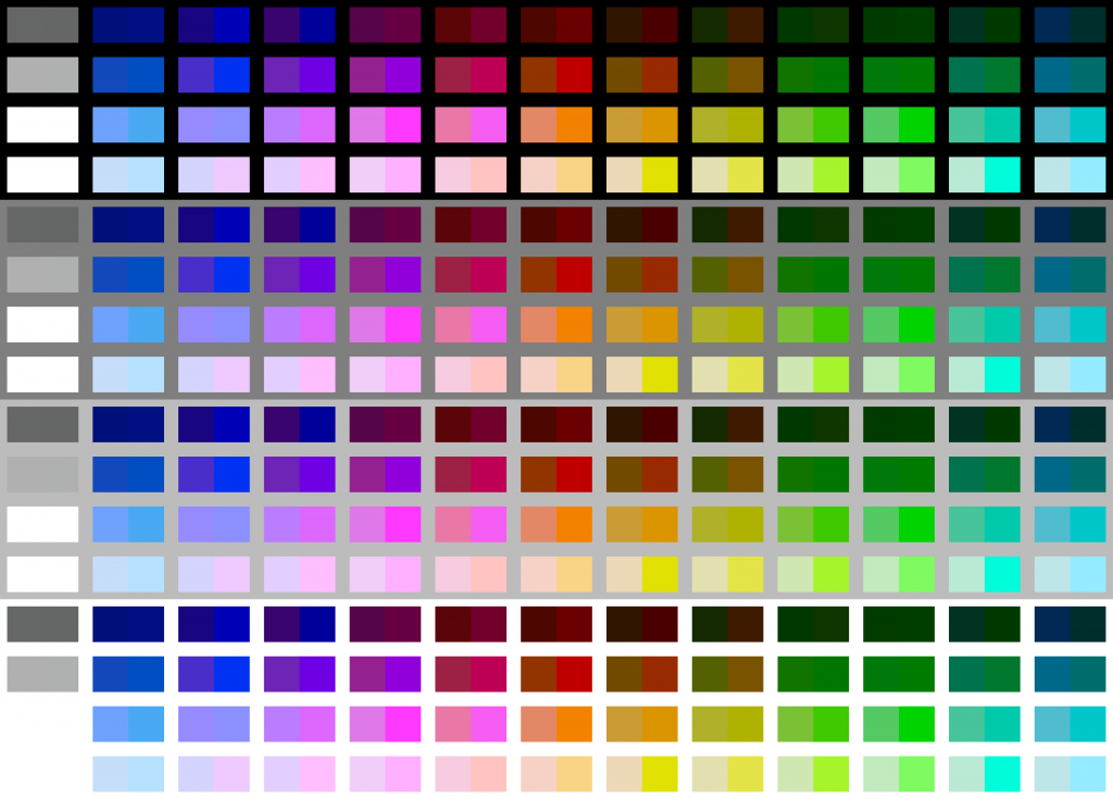
Once the dE values are calculated, I graphed their mean and standard deviation levels. To better represent the results visually, I used the Python “colormath” libaries to convert these values back to RGB, and then used ImageMagick to render them to a picture. For each palette, I render its version of the colour against the comparison console’s version, so that the values can be seen side by side and visually assessed. The renders are repeated on different shades of grey in order to assist visual comparison (zoom in on a colour to isolate it on the best background to help show off the differences). These are fun to compare, and most interesting is the enormous difference between the physical AV Famicom and Australian PAL NES themselves, demonstrating that even “real hardware” doesn’t always guarantee anything.
One example render is this, comparing my AV Famicom to the MiSTer using the Nintendo Playchoice 10 PPU palette:
And once again, it is very important to remind everyone that these values are not absolute. They are relative right down to my individual display device, as even slight differences in electrical equipment (remembering that our beloved Sony PVM broadcast monitors are getting quite long in the tooth now) will affect these differences, so even other PVM D20 owners won’t see identical results to mine. While these results are interesting, the only conclusive proof they offer anyone is myself and my displays (however you can use my method to repeat the process for yourself on your display, of course). And no, my results can’t be used to generate a new “conclusive NES palette”.
In the future I hope to repeat the whole process on other displays. I have numerous consumer CRTs I can test (all with different composite decoder chips and display characteristics), and I’d very much like to repeat the process on a good quality OLED display using a RetroTink2X as the composite decoder.
For now, you can see the results on my site, along with an FAQ (questions like: “Why do you spell ‘color’ as ‘colour’?”), the method, and some of the scripts and code I wrote to help me:
https://stickfreaks.com/colour/nes-colour-palette-comparisons
Time and resources permitting, I’ll have more of these in the future, as well as some videos to better document the process and help anyone else who wants to do the same for themselves. But for now, I’m taking a break to play some NES games. 🙂