I posted a week or so back an article that covered a brief history of colour science and Japanese CRT display standards. If you missed that, read up to explain what this post is all about:
https://www.retrorgb.com/colour-malarkey.html
Since then I’ve fleshed out my GitHub repo, and built on the maths and python code to generate more tools where you can experiment with the “D93” colour adaptations I’ve created. A reminder that these are merely “D93 simulations”, and are designed to get you somewhat close to the look of that colour system. However there are still a lot of caveats to cover depending on your display and how you use these tools.
First up, Extrems added the matrix values to the GameBoy Interface High Fidelity Edition. He put settings in the wiki which cover how to use these values to do D93 adaptations via the contrast settings. See the values here:
https://www.gc-forever.com/wiki/index.php?title=Game_Boy_Interface/High-Fidelity_Edition#–contrast
For MiSTer FPGA users, you can download pre-made gamma files from my repo, hosted here:
https://github.com/danmons/colour_matrix_adaptations/tree/main/mister
Place these in your /media/fat/gamma folder inside MiSTer, and select them from the Video Processing -> Gamma Correction menu.
One note on both of these these is that MiSTer’s video processor as well as the GBI options above are currently limited to colour conversion on a gamma/grey scale only. As such, a lot of the “Japan phosphor” simulations I spoke about in my previous post won’t be able to be replicated on these platforms. However I’m continuing working on more complex 3D LUTs to use with emulators like MAME that do allow this, so look out for more posts in the future on this topic with more advanced manipulations to play with. However for MiSTer, Like GBI above, these adaptations only work on the greyscale and white point. This is still fine for simulating the look and feel of the cooler D93 colour temperature popular on 1980s and 1990s Japanese domestic televisions and PC CRTs.
If you copy these gamma files across, you’ll notice there’s three files on offer. Why three different ones?
If you recall back to my previous post (linked at the top of this one), we talk about how attempting to show one colour system within another that’s too limited results in certain colours falling “out of gamut”. In digital processing, we call this “clipping”. There are going to be a small amount of colours that we simply cannot show on our sRGB D65 PC monitors or BT.709 D65 TVs when trying to simulate a D93 whitepoint.
We intuitively know D93 is a “cooler” whitepoint, and that this means a “bluer” image. It comes as no shock that applying these adaptations will make the images bluer. But what if they already have fully saturated blues? Let’s take a look at everyone’s favourite blue mascot, Sonic. This is a great example as we have pretty bold use of all three primary colours.
Take a look at this comparison image in a certain way. It’s an animated image of a D65 original and a D93 simulation, flicking back and forth 1 second apart. Let your eyes relax, and stare at a piece of the blue sky. You’ll notice that it gets considerably lighter as it flashes from the D65 reference image to the D93 simulated image.

Do the same for the green grass below now. You’ll notice that the relative luminance stays the same. The red on the badnik gets considerably darker. This makes sense as D65 to D93 adaptations reduce redness and increase blueness as colours get brighter. The problem here is that already high-blue colours can only go so high before they run out of headroom. If we had a nice wide-gammut HDR display system, we could display them all (one day, maybe one day, we’ll all have HDR screens and the browsers will have universal support for wide-gamut HDR images, but until then…). But we don’t, so we end up clipping blue information – some of the subtler shades in Sonic himself seem a little blown out in the brighter D93 version.
But what if we scaled back the image? Let’s take a look at a slightly different adaption: Do the same as before – stare at some blue sky for a while. You’ll notice the relative luminance jumps around a lot less now .
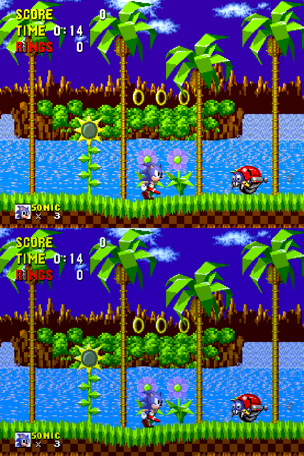
Now again, stare at the green grass. Unlike before, now it is shifting dramatically in luminance. Colour-wise, we’re seeing exactly the same transformations as before. All I’ve done is scale the peak brightness down to 80%. The human eye is particularly drawn to luminance/brightness/contrast differences, and it can be quite distracting to try and look for colour differences. However, our other issue of blues clipping above the maximum level is now somewhat sorted. Sonic himself seems “bluer”, but without the considerable detail loss.
We can compensate somewhat for the brightness loss here by simply upping our TV or monitor brightness (more useful for a fullscreen image than these demos in your web browser). For Sonic, this would probably be worthwhile if we wanted to experience the game in simulated D93 for extended periods of time.
But, what about games where we don’t have these same super-saturated colours? Let’s take a look at a much more pastel game, and Sonic’s own mascot rival. Here’s Super Mario World on the SNES, with the 100% D65 to D93 simulation. Do the same trick as before – find solid red, green and blue parts to the image. Defocus your eyes a little, and try to take in the luminance and colour changes.
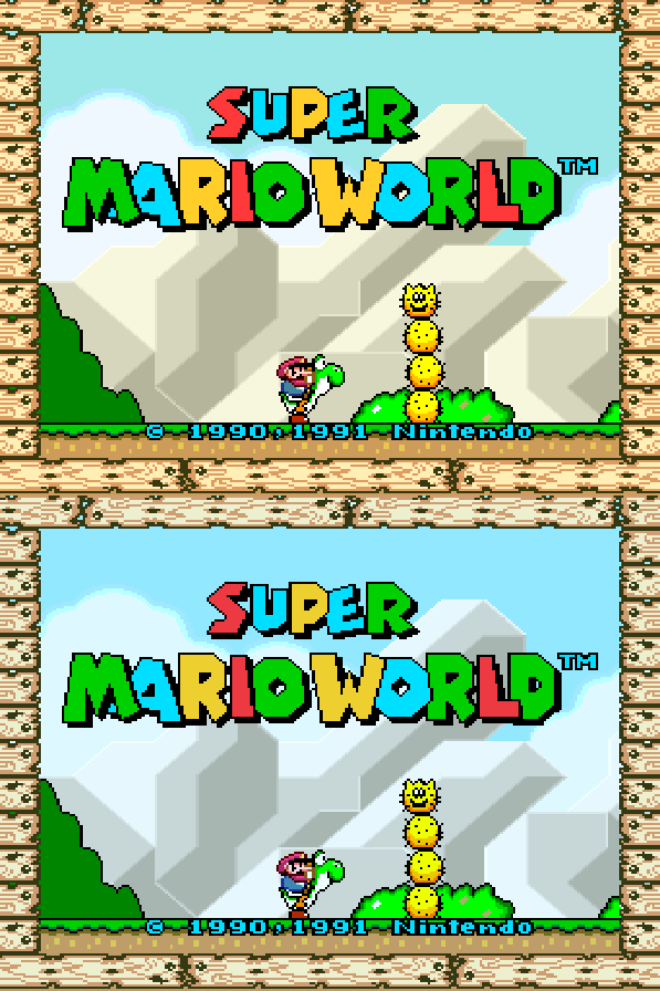
With far fewer deeply saturated colours, the clipping / blowout issue of Sonic doesn’t appear here. What about with our 80% version:

No real benefit here. All we get is a pretty huge luminance drop, and the colour changes compared to 100% otherwise seem the same, with no obvious signs of things not clipping that perhaps clipped in the brighter image. This is due mostly to a much less saturated colour palette that doesn’t suffer from the clipping. (Also interesting to see a cyan sky become bluer in D93).
Let’s repeat once more for Sonic 2, and more bright blue/green in the first level. Again, stare at a specific primary colour, and try to see both the colour shift and the luminance shift separately.
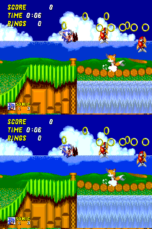

Potentially more pleasing again to drop away the greens than to overblow the blues.
Streets of Rage’s city intro is pleasantly dark, and the blue boost to D93 brightens the image too far:

Conversely the 80% darker version keeps our deep blues in tact, and makes the warmer colours cooler instead, keeping the evening feel correct.
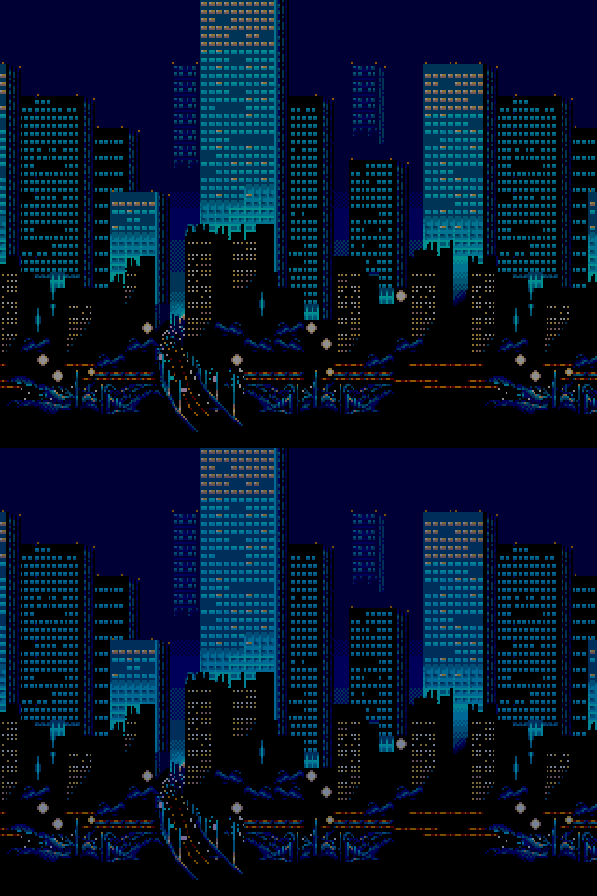
Worth noting that these A/B comparisons are going to be quite jarring as you observe them in this way. Human colour constancy factors in when you play these on a larger screen for extended periods of time. After 10 minutes of play, you’ll feel like there’s far less shift, and returning to a D65 image will give you the opposite effect – you’ll feel an image that’s far too warm.
For the mathematically curious, you can look at the gamma txt files to see where this clipping happens. The 100% file clips 32 levels of blue. The 90% file clips 21 levels of blue, and the 80% file clips 8 levels of blue. Full blue clipping stops at 74%, however that’s quite dark, and the human-noticable difference between that and 80% makes it not worth having the extra file.
Conversely in the red channel which suffers the highest drop, it sees a peak of red236 in the 100% file, red225 in the 90% file, and red214 in the 80% file.
Ultimately which of these looks better to you will depend on not only your individual taste, but the content you choose. Games with bold blues will likely benefit from the 80% file. Games with subtle palettes or dark scenes will likely look better with the 100% file. And 90% is there in the middle for a blend.
Outside of these brightness caveats, the comparison from western warm D65 to Japanese cool D93 is quite fun, and leaves a lot of open questions as to colour design, especially in the 16 bit era with more complex palettes on offer.
Streets of Rage 2’s rather green street changes over to blue. Character skin tones become less orange, and Axel’s dirty yellow shirt suddenly feels like a cleaner white.
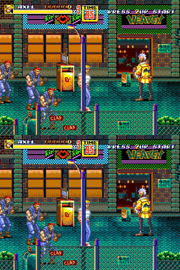
And I think the 80% version here does this particular level no favours. Maybe some of the bluer later levels (the baseball diamond elevator, for example) would be different however.

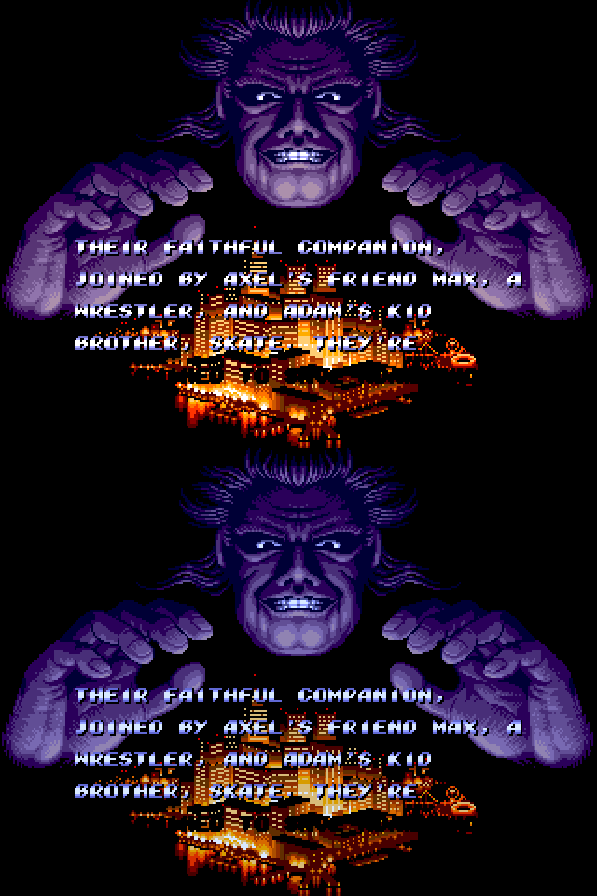
Back on the SoR2 title screen though, and similar to SoR1, the 100% version brightens things considerably.

Versus the 80% version, which keeps the ominous feel in tact:
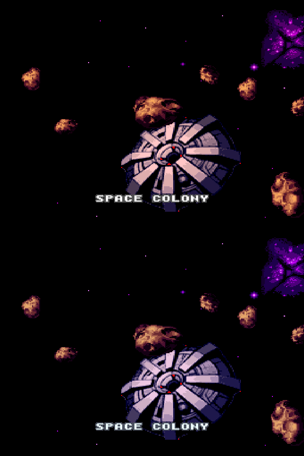
The Space Colony in Super Metroid’s opening sequence feels more metallic under a cooler white point. The far away galaxy gets downgraded from an intense purple to a somewhat more boring blue however. As this is a dark game, I’ll not bother with the 80% scale down versions.
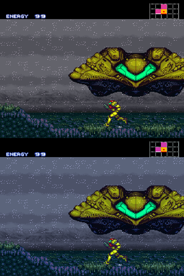
Planet side, and the Zebes atmosphere suddenly feels much colder with the Japanese D93 target simulated.
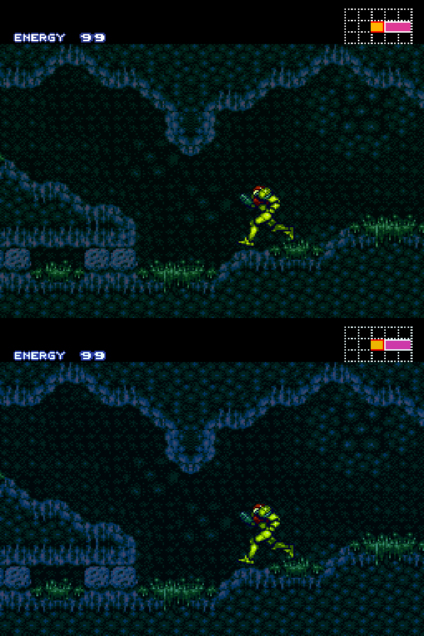
Indoors, and suddenly Super Metroid feels a lot more like NES Metroid with a shift from warmer greens to cooler blues.
And I said in my previous post that I wouldn’t touch NES content because of its contentions colour nature, however lets take a look anyway. We all know the story of the NES and “there is no true colour palette” for many technical reasons. But what happens when you take one random palette, and further adapt it with a D93 simulation?
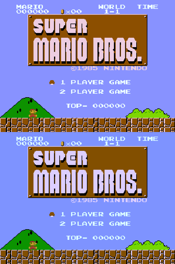
Was that purple Mario sky ever meant to be so purple? Were Mario’s famously red dungarees even meant to red, or closer to brown?
Who knows. But you can enjoy all the options for yourself now, with a couple of clicks of a menu. Happy colour fiddling.
