Mike Chi has just released a firmware update for the RetroTINK 4K’s (both CE & Pro) that adds an option to emulate the improper colors of the NES, using HDR displays. To enable this feature, load the latest *experimental firmware, turn on HDR10, then go the the SDP Decoder advanced sub-menu and turn Expanded Gamut On. The default settings are meant to be used with a CRT mask, but if you prefer without, then you’ll need to decrease the nits to about 300 in the color correction menu. And once again, this feature can only be enabled with HDR on. Lots more info after the links:
Download the Firmware: https://retrotink-llc.github.io/firmware/4k-experimental.html
Purchase the RT4K: https://retrorgb.link/retrotink4k
*Just a quick note, these “experimental” firmwares are very stable, but if you run into any issues, you can switch to any other firmware at any time. And there’s certainly no chance of these damaging your TINK or anything like that, so feel free to try it! Back to the post…
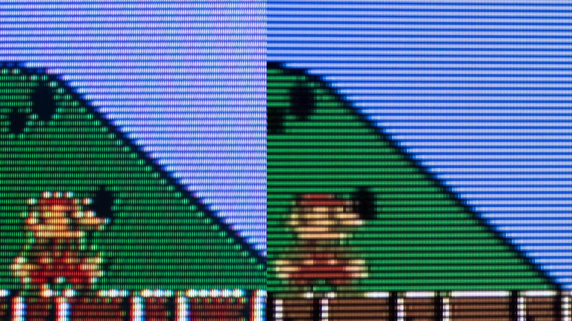
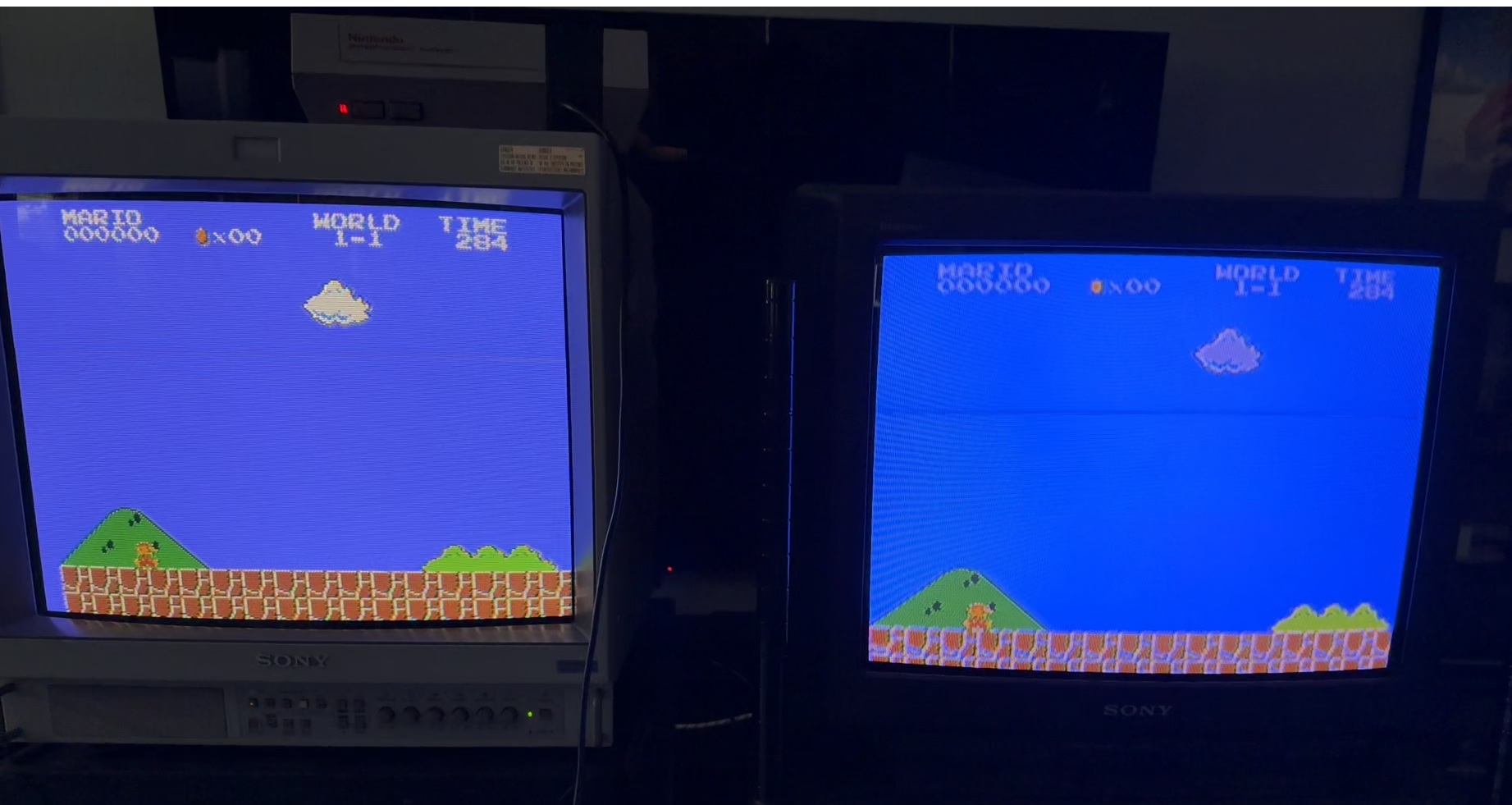
First, I need to apologize and say these pictures are the best I could do. In person, the difference is immediately obvious, but taking proper pictures of displays is hard enough, let alone CRT’s and HDR OLED’s! I spent a few hours playing around with the feature and trying to capture the look, but I think I need to explain what you’re looking at and then try to describe it a bit better: The above picture is a Sony PVM 20M2MDU on the left and an LG 32GS95UE OLED on the right, connected to the RetroTINK 4K Pro. Both are connected to a recapped, but otherwise unmodded front-loading NES console, playing an original SMB cartridge (yes, the RT4K really does clean up composite that much). For the RT4K, I just loaded Kuro’s 20L5 profile (which enabled HDR), then enabled the Expanded Gamut and 3D Comb Filter.
The picture below (click for full-sized) is the same OLED on the right, with a consumer-grade KV-20V60 on the left. It’s the same NES and the same TINK settings, however it uses Kuro’s KV-FV310 profile – Not an exact match, but closer than the PVM profile to this consumer display.
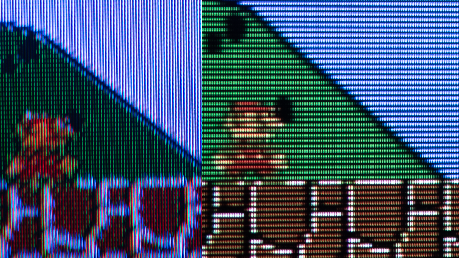
In person, the PVM looked much more purple than blue, however if I moved the chroma knob just a bit to the right, the color almost matched the RT4K’s exactly. The consumer CRT was different though – It was very blue in person. I tried really hard to get a good example with my GH5 camera, but this picture from my iPhone was the closest I could get to what it looked like with my eyes:
Of course, if you lined up 10 slightly different CRT’s and ran the same NES through them via a cvbs distribution amp, each one would look different anyway. I always thought it was because of the old NTSC joke “Never The Same Color”, but according to Mike, the discrepancy between NES colors is actually the result of the NES outputting “illegal” values. That’s why each CRT TV would look different, as the different decoding chips and circuits would all interpret the “wrong” colors differently. Which is why so many of us correctly remember the SMB sky being a different color!
…and as a note, I did test this with and without Dan Mons’ D93 color profile and while it did make the sky more blue, this was different…especially with CRT mask emulation turned on. And of course, you’re welcome to try any combination of settings and whatever looks best to your eyes is the right answer. But I’m really appreciative that Mike got the RT4K even closer to a real CRT’s output than ever and I think he nailed it!
Working on a new feature to reproduce the illegal composite NTSC colors from systems like the NES!
Thanks to HDR, we can simulate how an old fashioned CRT gun can be overdriven to create the intense colors that have been lost with digital decoders.
Available on RT4K FW 1.98 pic.twitter.com/zHcSSCjCVv
— Mike Chi (@retrotink2) September 7, 2025